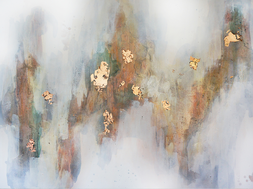
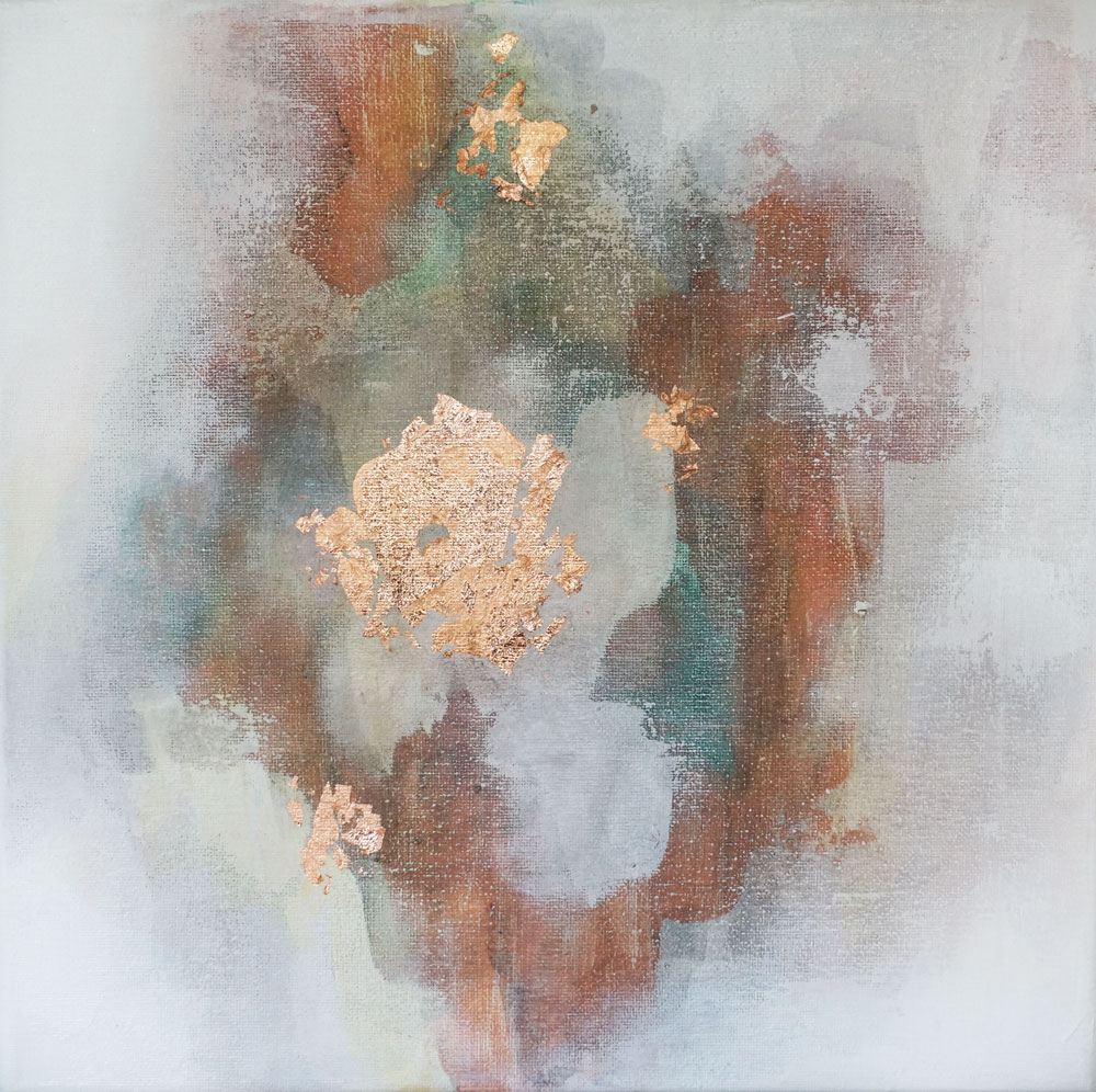
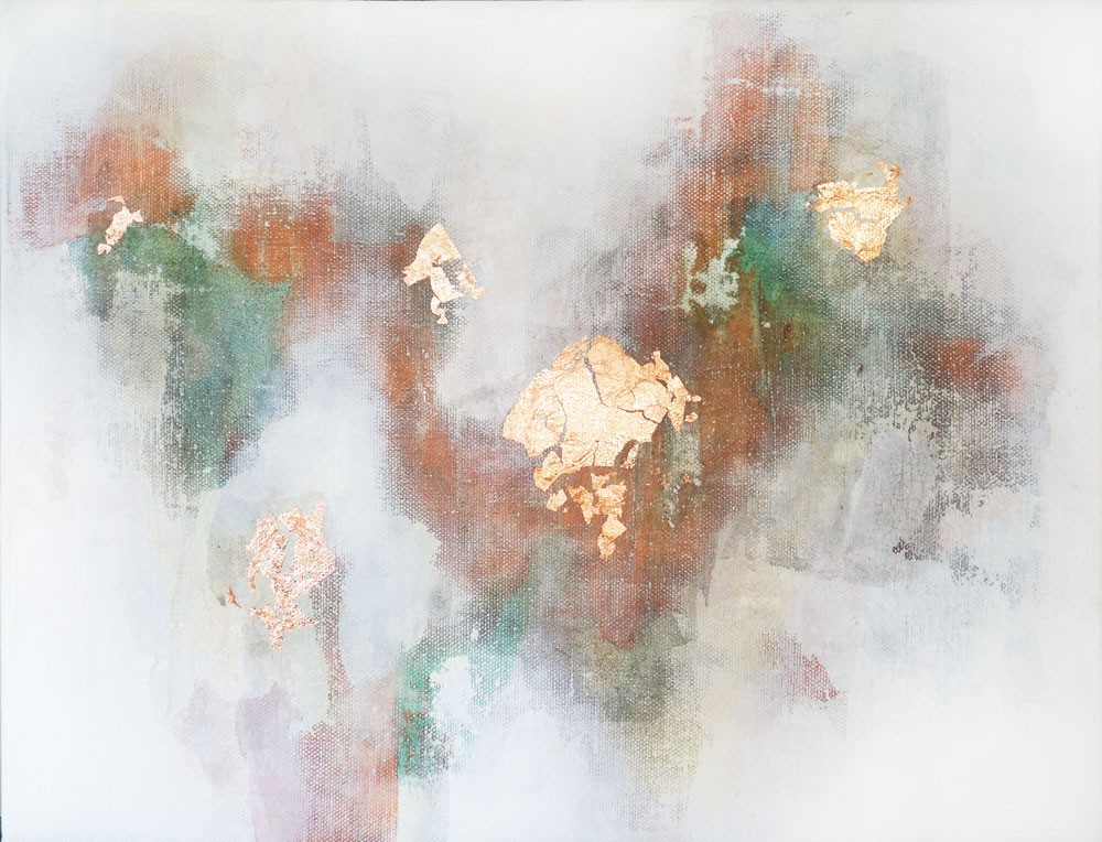
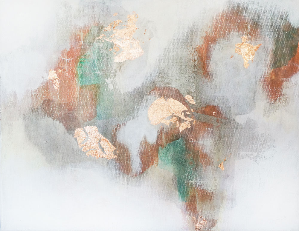
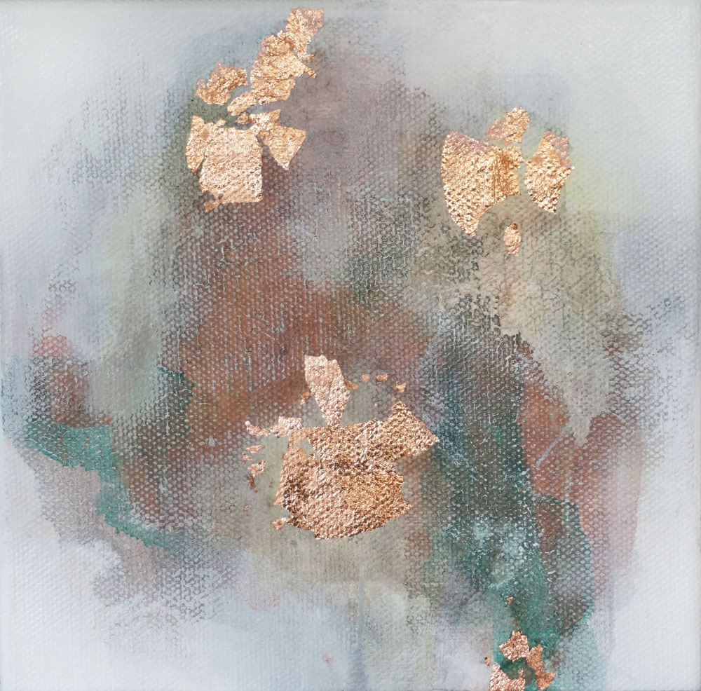
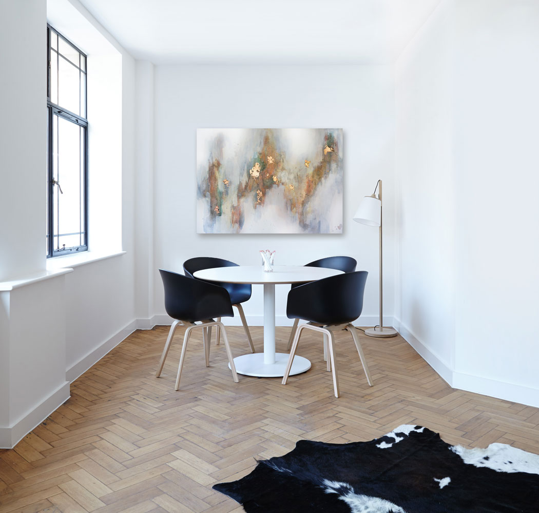
The Better Together series is a two part series. The pieces in the first section are “Be Free, 36”x48”, “Bare Your Soul,12”x12”, “Brace Yourself, 11”x14”, “Back For More, 11”x14”, “Brilliant Idea, 6”x6”, and “Bad Idea, 6”x6” These pieces are similar to most of my other works in terms of composition, movement, and palette. They are soft and warm evoking warm summer sun and golden rays of light.
I focused this segment of the B series on textural exploration and a more liberal composition philosophy. These pieces are rich in color, and texture. For me, these pieces are reminiscent of a Tuscan sunset. Pink skies light up terra cotta colors and golden rays of light enrich the texture.
Here are all of the pieces in this little series:
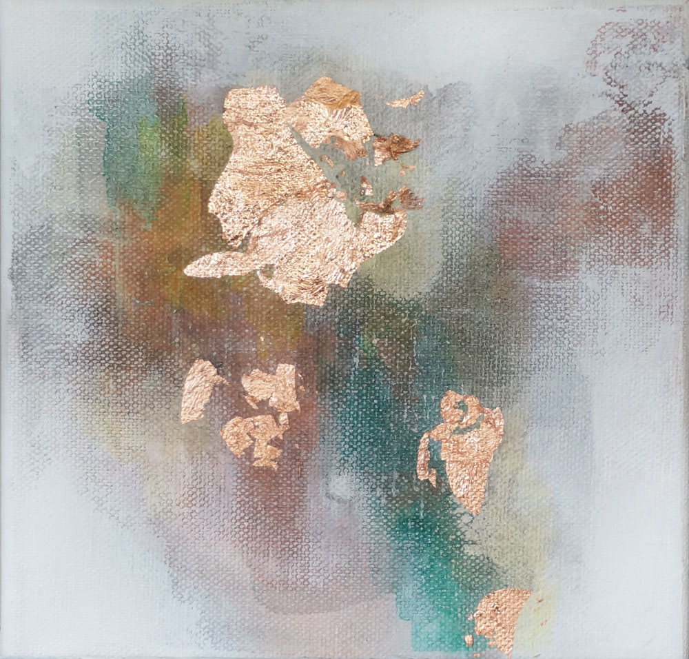
These pieces are the second group in the Better Together series:
The first group of in this series is much more consistent with my other, previous works. The style is similar with a focus on warm tones, rich peaches, saturated emerald greens, and washed in a golden glaze on a gray background. The focus in these pieces is on the layers and dimensionality. A rich depth is created wan layering many thin layers on top of each other.
know what you’re asking, “Christine, why do the titles all start with the letter B?” The truth is that all of the themes I was thinking about started with the letter B. As silly as it sounds, I usually like to roll with things like that if that is the direction the creativity is flowing. I’ve never been one to fight the current of where my creativity leads. Naming my pieces has always been one of my favorite parts of creation and this time the B’s had my whole mind.
This series has been a restorative pleasure. The focus on both visual and physical depth in art has been a rich explorative experience. There are so many definitions of depth depending on your perspective and experience. In this mini series, I hope you got to experience two different kinds in this collection.


